It’s a great time to be in marketing design. Tools are more powerful than ever before. Resources are more accessible than ever before. And we have the benefit of standing on some impressively tall, creative shoulders.
But today, designers feel shifting underfoot as asset owners try nestling into more secure market positions. Adobe, maker of the design industry’s most popular software in its Adobe Creative Cloud, is at center stage. The software giant is in the middle of enacting not one but two sea changes that can impact your marketing.
First, causing a stir among color-concerned creative professionals this spring, Adobe dropped Pantone color libraries from its Creative Cloud apps. The next shoe to drop involves PostScript Type 1 fonts, for which Adobe will discontinue support in a few short months.
What it means to marketers
The moves may seem benign to non-designers, and, in truth, there are solutions to address them. But the shift reminds us that familiar dynamics can change—and others actually own the ingredients we’re cooking with.
“We’re talking about industry standards that are going to impact what creative teams do moving forward,” says Jenny Seavitt, creative lead for ddm. “PostScript Type 1 fonts have been around since 1983—whoa! That’s a long time.”
The good news on the font front is that your brand’s favorite fonts won’t actually be going away. The world couldn’t do without standbys like Helvetica and Courier, right? But the file format behind that font on your team’s computers will stop working until upgraded, and sometimes purchased.
Imagine having to do that with every computer that needs to display your brand’s standard fonts, or those fonts will simply not work and be replaced with something that doesn’t look right. Then stop imagining, because that’s what creative teams are facing—or will be if they haven’t addressed it yet.
An ounce-of-prevention approach is probably best here, Seavitt says.
“If we don’t start conversions now with a new font, everything is going to have to be converted in our workflow, and that’s going to be painstaking,” she says. “It’s going to be super interesting to see how people handle this.”
Adobe gave a taste of how it would be this year, having already sunsetted support for Type 1 fonts in Adobe Photoshop. But the fonts will be going away across all its Creative Cloud assets in January 2023. So now is the time to make sure your company has all the right fonts in non-Type 1 formats.
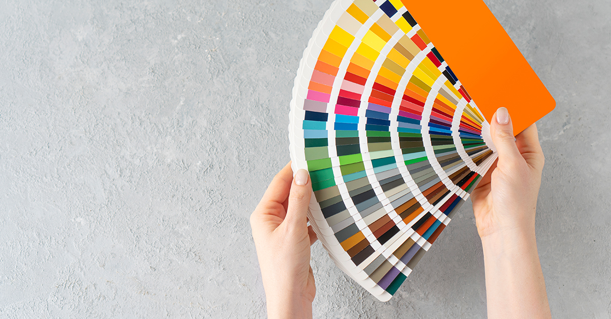
It’s not easy being PMS 347
Colors present a different story, but also one with a timely angle.
It was in 1963 that Pantone, now a subsidiary of Grand Rapids-based X-Rite, introduced its formal system to name colors with numbers. The system, called the Pantone Matching System (PMS), established an objective reference point for printed shades.
“Pantone wasn’t the first color-standards language, but it’s undoubtedly the most well known,” writes Diana Budds in Fast Company, explaining that Pantone founder Lawrence Herbert’s fast, coordinated global launch entrenched his system as the world’s predominant color nomenclature.
With Pantone being the most popular universal color language, Adobe found it wise to build PMS matching into its software. It’s been there for decades.
A departure from Pantone’s standards isn’t completely out of the PMS 072… er, blue. Increasingly popular digital presses use a four-color process that mixes cyan, magenta, yellow, and black (CMYK), which often can’t precisely replicate Pantone reference points the way spot-color offset presses can. Still, nearly every firm’s brand style guide has the PMS-identified spot color as its main reference point. And every large-run commercial printer and sign maker will reference a PMS color rather than a mix of CMYK. So, it’s a far cry from irrelevant.
Plus, Seavitt attests, creative professionals already are facing some hurdles with color matches.
“As a designer, you want consistent color,” she says. “Through the pandemic, and even before that, we lost a lot of control of consistency. Once you have a design, either the client is going to print it, or we send it to a printer. There aren’t as many opportunities for press checks and quality control, because we’re removed and looking at a PDF proof.”
Removing what the industry has long held as its most popular color reference point is an unwelcome kicker that’s ruffled the feathers of many designers.
Of course, Pantone has no intention of removing itself from any color conversation. While it will yield its place inside the native Adobe programs, Pantone has launched Pantone Connect, its own app meant to bring live-updated color libraries into Adobe creative tools.
Finding normal again
If your creative and technology teams spend a few more hours, making a few more file updates, with a few more licensing fees to adjust to Adobe’s changes, at least you’re in good company. And if you haven’t started prepping for the fontpocalypse, there are ample resources to get you started.
But, in the spirit of counting your blessings, keep in mind that hurdles like these are side effects of having within our reach a cache of intellectual property that allows us to create increasingly stunning design to wow our prospects.
The ground may shift, but it’s still a great time to be in marketing design.