
Whether your audience reads every financial report you send out or they simply look at the year-end annualized returns and move on, you have the potential to expose them to a level of creativity that might surprise them. But, before we get into that, a little psychology on color.
Why do so many financial services companies use the color blue?
Red is the color of power and who doesn’t want power? Red grabs people’s attention and holds it. Arguably, it’s the most popular color in marketing. With a range of cultural meanings from life, health, and love to vigor, anger, and war, the common thread is they all require passion.
While many of us are passionate about finances, in that world, red has historically signaled bad things. For example, being “in the red” signals debt or running at a deficit, a phrase originating in the early 1900s accounting practices where financial losses were literally written in red ink. And to “see red” signifies anger. Therefore, many financial services companies steer clear of that color—in logos and charts.

The color blue, however, is associated with attributes like stability, integrity, and trust—exactly what you want in a financial services firm.
According to ScienceABC, a color is not registered in your brain as just a color. When you see a color, you make associations with a particular experience, person, or thing over your lifetime. Therefore, emotions become a part of “seeing” a color. Blue is the color most preferred by both men and women, possibly because of positive feelings tied up in the sky and oceans.
Therefore, and not surprisingly, blue is widely used in financial company brand logos. Among the attributes listed above, blue is also safe, inoffensive, and sophisticated. Indeed, out of 50 top financial services brands, almost half have blue logos and another seven have blue elements.
Of course, this means you need to put forth more effort to differentiate yourself. It’s hard to stand out when you look like your competitor—especially with compliance regulations that keep you from straying too far from the norm. This is where creativity takes a giant leap forward. When communication collateral tells a story, it becomes impactful and engaging. Creativity isn’t always just about design and color; it’s present in the connecting of ideas as well.
Where the magic happens
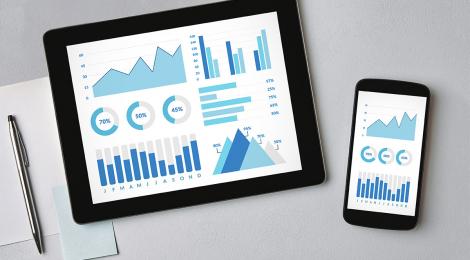
It’s been said, without creativity, all you’re doing is running the same numbers in the same way, inevitably producing the same results. By themselves, numbers that comprise returns, holdings, growth, deviation, and a myriad of other financial reporting stats are not terribly attractive. Sure, if returns are large or growth is high, people tend to sit up and take notice. But with all the prospectuses, fact sheets, PowerPoints, brochures, and white papers being produced and shoved in front of your portfolio managers and investors, how do you make them visually palatable quarter after quarter, year after year—and stand out in the crowd?
In print, many fact sheets are automated now. In fact, we automate hundreds of fact sheets every quarter for our clients, which elevates the level of accuracy. The quantitative data on these sheets can sometimes be overwhelming, so the creative design is crucial to their effectiveness. We start with what information a client wants reported based on industry trends or compliance regulations, we gather raw data direct from the source to import into our automation platform, we design a template using the client’s brand standards, and we lay out the data in a manner that tells the story of the fund or SMA. With the more recent “cutting the clutter” industry trend, we keep our eye on removing outdated disclosures, organizing like information in one place, and using concise, easy-to-understand language.
When PowerPoint decks, white papers, and sales sheets are added to the mix, a cohesive brand awareness begins to take shape. The consistency in each piece of collateral then differentiates your business from competitors, builds trust with your audience, and provides a good first impression.
Online financial reporting is different. It also requires efficiency, speed, and control. But interactivity is fast becoming an expectation. It could be a simple interactive chart or, if you really want to get someone’s attention, this larger interactive infographic fits the bill.
It’s just not enough to simply add photos of people relaxing in retirement to draw attention. Not in today’s world anyway. Investors want fast and accurate quarterly reporting and for deeper dives, they want engaging and thoroughness. They want information but they want it served when they want it and how they want it.
Technology matters
If you’ve been paying attention, you’ll know there has been a generational shift. Millennials now make up the largest segment of the workforce, while Gen Z is the largest age group. Combined, more than half of Americans are millennials or younger. We recently discussed how different generations invest and what it means for marketers. While your younger audience may be demanding more tech, the pandemic has made digital access even more important—for all ages.